Posts look different on Sparkable. But why? 👀
Find out how we've come up with a unique design for posts.
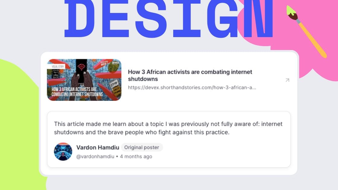
At Sparkable, we're working on a new platform design that fosters healthier online interactions. This type of design is called prosocial design.
In this newsletter, we look at what, in our case, a prosocial redesign looks like for the platform's most essential part: posts.
📦 The contents of a post
Usually, posts on social media platforms consist of:
- A text
- An optionally attached link, picture, or video
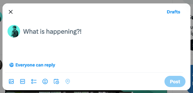
As an example, here's what creating a post on Twitter/X looks like:
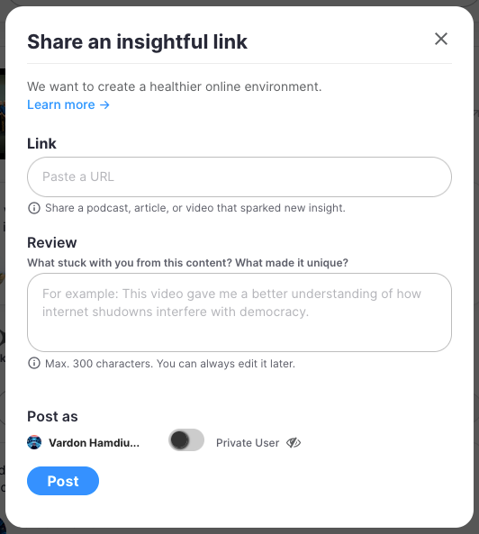
On Sparkable, however, all posts consist of:
- A link to existing content
- A review of that content
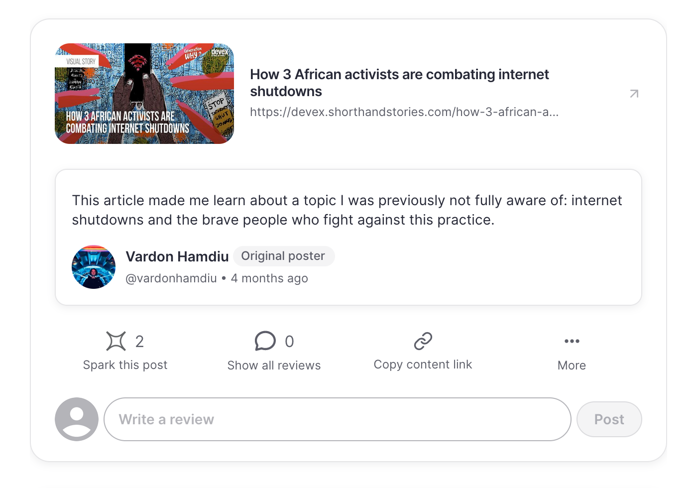
Here's what creating a post on Sparkable looks like:
• Focusing on sharing content that others made helps avoid personal attacks and facilitates discussion around the content, not the person posting it.
• Instead of adding more content to our online environment, Sparkable aims to collect the most insightful content. There are enough amazing podcasts, articles, and videos on the internet; they're just difficult to find in all the noise.
• Sparkable's design disincentivizes self-promotion, which might result in fewer posts, but the quality of the posts should be higher.
📄 The layout of a post
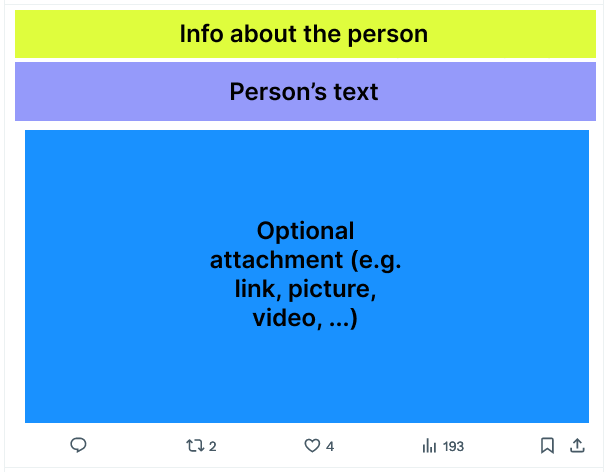
Today's social media platforms usually center on the person who made the post.
That's why information about the person is at the top of the visual hierarchy, followed by the person's text and optional attachments:

Sparkable, in turn, focuses on the shared content link rather than the person who made the post.
That's why the visual hierarchy starts with the content link, followed by the person's review text, and finally, the information about the person.
Here's a simplified view of posts on Twitter/X:
...and on Sparkable:
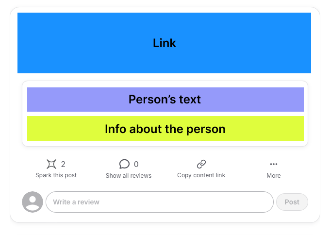
• Centering the content instead of the person in the post design should help foster a healthier, less hostile, civil discourse.
• It should also make it harder for polarizing figures to get outsized attention.
🎁 More prosocial design features
In addition to the design features mentioned so far, some prosocial features are less visible on the surface. For example:
Review limit
Each person can leave only one review per post.
• To avoid the often destructive and dysfunctional dynamics of comment sections where a few people go back and forth shouting at each other while the rest watch in dismay.
• On Sparkable, reviews are always about your thoughts on the content, not what others say. The limit to one review strengthens that approach.
• (Those two points are why we went with the concept of reviews, not comments.)
Bridging-based ranking
A bridging-based algorithm assesses in the background which posts and reviews are rated highly by people who previously disagreed in their ratings and displays those posts and reviews first.
• If people who previously disagreed in their ratings agree and rate a content highly, it's a strong indicator that this content is valuable to people from different points of view.
• Bridging-based ranking shifts the incentives for creators, rewarding content that gets rated highly by people with diverse perspectives instead of rage- or clickbait content.
• Today's advertisement-driven platforms use algorithms that favor engagement, even if they stoke division and weaken our democracy. Bridging-based ranking is an antidote to that.
💭 Give us your feedback!
Everything we do is an experiment. We're a young nonprofit trying to see what happens if we redesign social media from scratch to foster healthier interactions.
This means we're actively inviting your feedback. We know it might feel daunting to message an organization, but wonderful things can come from it. You can actively help shape where this platform is going! 😊
So, we‘ll leave you with that request:

Please let us know your thoughts!


